

Lane markers
SteelCityMafia895 Thursday, 8/22/2024
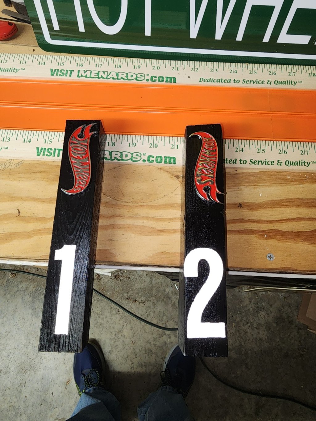
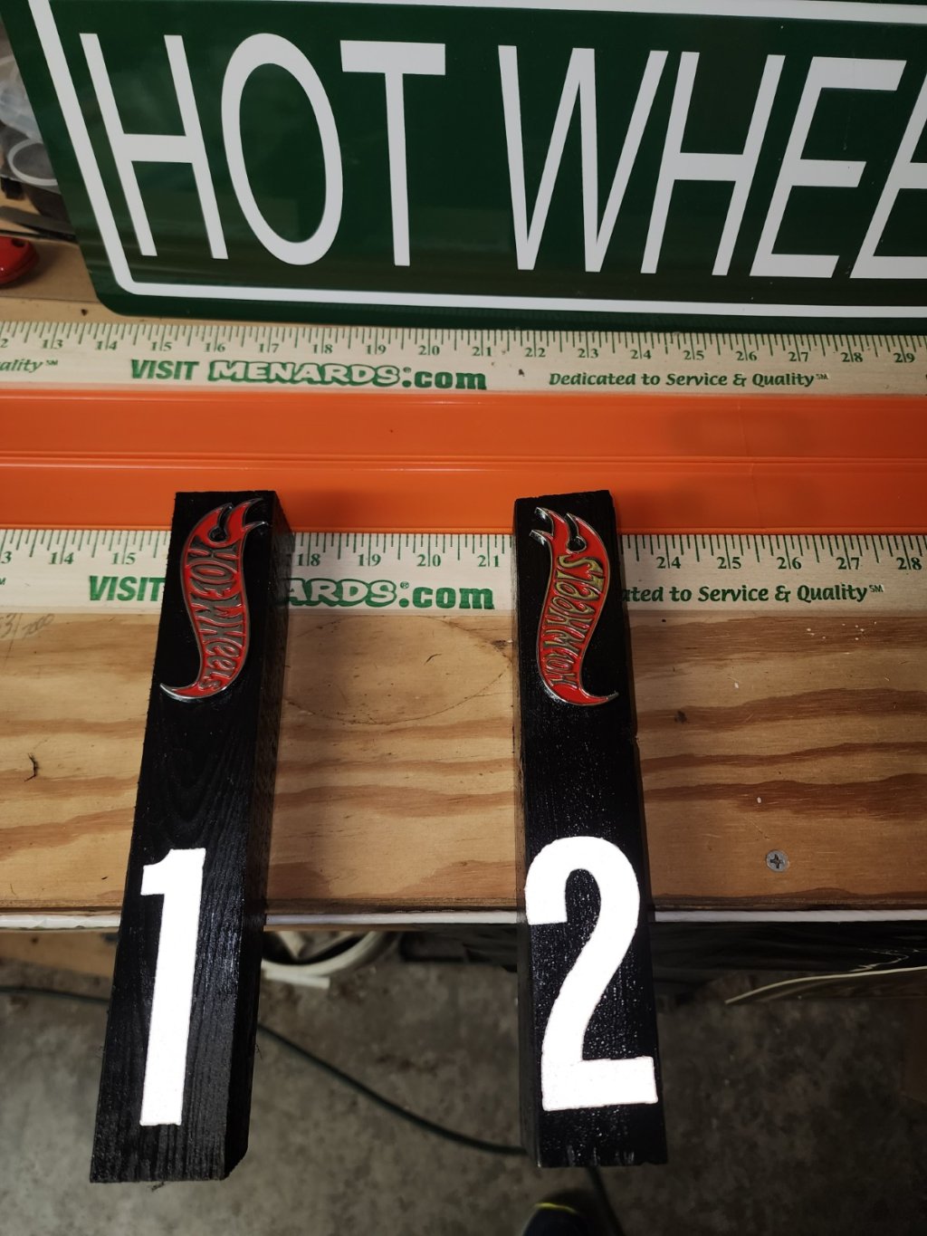
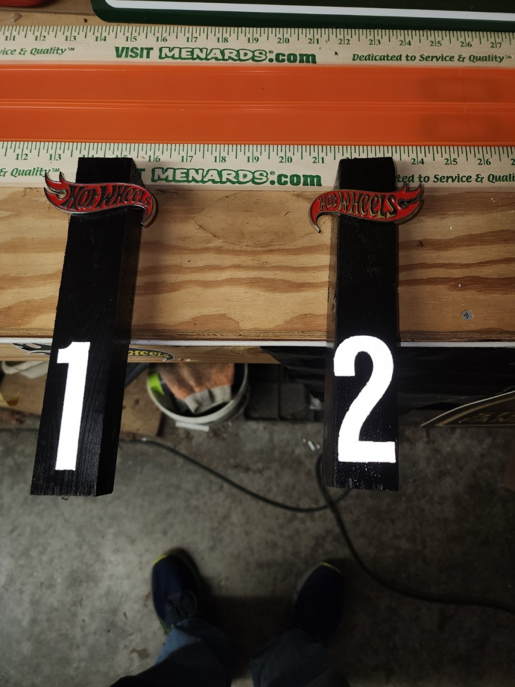
Making new lane markers for my track. Have some Hot Wheels logos to put on them. Looking for input on which orientation looks best. 1, 2, 3 or 4. 
Discussion


ConMan_Customs 8/22/24
I think 1 or 3 is good. In my opinion the direction of the flames being synced is more pleasing than the direction of the text


Stoopid_Fish_Racing 8/22/24
Not a fan of the horizontal ones as much as the verticle ones! They all look nice! But I don't think you can go wrong with any of them!


Chris_Hood 8/24/24
100% with ConMan Customs here. 1 or 3. I also like the symmetry. Chances are, eyes will be on the cars racing instead of reading the script in the Hot Wheels logos themselves
Great how you offered the different arrangements so clearly to us!
Log in to join the conversation or sign-up now
I get it, I see what you’re asking and I have an opinion. One (top pic) is better than 3, 2 no, 4 is so-so. Those badges look like they’re for a real car. Very nice.